Bilderpakete
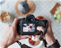
Mit Zugriff auf über 400 Millionen Fotos, Vektorgrafiken, Illustrationen und mehr. Beinhaltet mit KI erzeugte Bilder!
Videopakete
Ein Archiv mit 28 Millionen hochwertigen Videoclips. Wählen Sie zwischen Paketen und Abonnement.
Musik-Pakete
Laden Sie einzelne Tracks herunter oder erwerben Sie ein Abonnement mit unbegrenzten Downloads.


White
As the lightest color and the opposite of black, white has a special place in the world of color. Not only does it evoke a blanket of new-fallen snow or a cold, refreshing glass of milk, it’s also associated with cleanliness, purity and the idea of a fresh start. Think of the first blank page of a brand-new notebook. As modern minimalism has become a prevailing design aesthetic, white has become one of the most popular shades for home decor. Layer colors with different undertones to take this look from stark and blank to warm and inviting. Because it’s a neutral, white can go with just about any color palette and aesthetic. However, it’s important to choose a shade with the right undertones for a harmonious effect. For a crisp, sophisticated hue, look for blue undertones. Yellow undertones create a warm, creamy hue. The colors you choose for the rest of the room should share these warm or cool undertones. Wearing this color can be tricky, and not just because of the endless stain potential. As with your home, it’s important to select the right undertones. For best results, determine whether you have a cool or warm complexion and choose pieces accordingly. When used for structured pieces, this hue looks modern and sophisticated. Flowing dresses and blouses create romantic appeal.
#FFFFFF
#FFFFFF
#B3B3B3
#FFFFFF
#FFFFFF


Find more colors
Lassen Sie sich inspirieren und sichern Sie sich kreative Tools

Farbenlehre für Vermarkter und Inhaber kleiner Unternehmen

Komplette Anleitung zum Thema Farben für Designs
Lernen Sie alles, was Sie wissen müssen, um erfolgreich Farben für Designs zu verwenden. Farbenlehre, Farbbedeutungen und Farbmodi helfen Ihnen bei der Auswahl der richtigen Palette für Ihre Arbeit.

35 kostenlose Zine-Textur-Overlays

Kann es mit dem Designen losgehen?
Testen Sie Shutterstock Editor, die einfache und effiziente Design-App. Erstellen Sie professionelle Social-Media-Beiträge, Angebote und mehr.
